So you want to know how a simple line sketch turns into a moody, atmospheric fantasy scene? Spoiler alert: it involves a lot of layers (this particular art has 91 layers) , some questionable color choices that get fixed later, and many many hours of screen time.
The Grand Plan
Before touching a single digital brush, there's the sketch. This is where the whole composition gets figured out: where the character sits, how it interacts with the environment, what kind of vibe we're going for and if it's a lone figure or has companions.
And because I am a fantasy illustrator, in this case, we're creating a fantasy scene with a woman and her very large, very intimidating some kind of a pet creature.
Adding the first splash of color
I hope you have been smart enough and made your sketch on a transparent layer. Because now you need to add another layer, transparent again, and put it under your line art. I won't mention it again but we will always work on transparent layers. For the moment only background layer has a solid color and it should be at the very bottom.
Anatomy in colors
This is where things start looking less like a coloring book and more like actual art. The base colors go down first. Think of it as the foundation of a house. At this point you should see in your head the final result so you know the direction you are going. It means you already envision the colors so you start building a vibe.
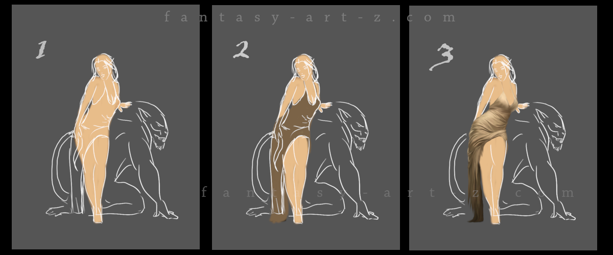
First, put the color on human body to get the anatomy right. (Image 1, Step 1) The anatomy is a fundamental thing in art and in this early stage, applying that first layer of color helps reveal whether the proportions are working. It's easier to spot anatomical issues when you can see the form starting to take shape rather than just looking at lines. So that base color? It's doing double duty - establishing value AND checking if everything is built correctly before going too far down the painting road.
Brush to use? At this point, anything round can do it, with hardness 75-100%. Color? Keep it close to human skin color.
Clothes and fabric
Now add another layer and apply the base color for the dress. (Image 1, Step 2) At this point you can hide the line art because now you have your basic shapes. Don't delete it, you may go back to it many times down the road, but I keep line art visible in my videos and this tutorial so you can see better what is going on.
The difficult part for many artists, especially for the ones that just started their artistic journey is to make folds and wrinkles on clothes. (Image 1, Step 3) And honestly? It stays difficult even when you've been doing this for years. Every single fold happens because of force. Something is pulling it, pushing it, compressing it, or gravity is dragging it down.
Think about tension points. Those are basically any spot where force is applied to the fabric. An elbow bending? Tension point. A belt cinching in? Tension point. Gravity pulling down from where the fabric hangs? Tension point. Once you spot these points, the folds start making sense because they all radiate from or react to these forces.
💡 Helpful trick :: folds are basically cylinders. Seriously. When you're shading a fold, think of it like a tiny tube. It's got a highlight where the light hits, a mid-tone, a shadow on the darker side, and sometimes even a reflected light bouncing back from nearby fabric. Breaking down these complex wrinkles into simple cylindrical shapes makes them way less intimidating to paint.
The best advice? Look at real references. Take photos of yourself in different poses, study how your clothes fold when you sit, stand, or move. The more you observe real fabric in action, the less you're guessing and the more you're actually understanding what's happening.
💡 Helpful trick : If you can't make it right no matter what, use photo-bashing technique.
Photo Bashing: Your Secret Weapon
What's photo bashing? Simple - you take a real photo of fabric with the folds you need, drop it into your painting, and then paint over it. Adjust the colors to match your scene, blend the edges, add your own touches, and boom - realistic folds without the headache.
It's not cheating, it's smart. Professional concept artists do this all the time. The photo gives you the foundation with correct lighting and realistic wrinkles, and your painting skills make it fit seamlessly into your artwork. Think of it like using a reference, except the reference is actually in your painting, hiding under your brushstrokes.
Just make sure you're using royalty-free stock photos or your own photographs, and always paint over them enough that they blend naturally with your art style.
Getting Some Actual Skin
This is where the character stops looking like a cardboard cut-out and starts looking like an actual person.
Building realistic skin tones
Layers upon layers here you are building a tone of subtle color shifts. Real skin isn't one color. It's got warm tones, cool tones, and everything in between. Shadows get deeper here, and the three-dimensional form really starts to emerge.
This is also the phase where you zoom in way too close, obsess over tiny details nobody will ever notice, then zoom out and realize you need to fix something completely different. Classic.
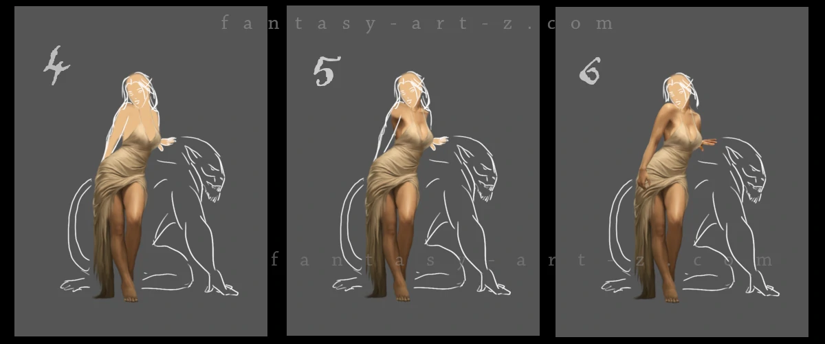
💡 Helpful trick : find "Dodge/Burn Tool" in your painting program and use it. Take a soft brush 75% or even softer, put "Hardness" and "Force" of the tool at 8-10 and softly brush the outer edges of legs with Burn tool to make it darker, where the shadows fall. In the middle, or where you want the light fall use Dodge tool. (Image 2, Step 4)
Don't forget to add shadows under the clothes. we will do it also a little bit later. For the moment, after the legs, I am going up to shoulders and bust. This is why we put the dress on before coloring the body. It saves time because now I don't need to paint body in details under the clothes. (Image 2, Step 5)
Don't forget about the light source. It's very important. But if you are just starting , don't worry, at the end of the Part 2 of this tutorial I will show you some tricks that will help you to change lighting and shadows at the very end of the painting process.
In Image 2, Step 6 we add hands. This is another one of big artists headache. Not everyone finds them easy to draw. This is another area where many artists struggle. Fingers can be surprisingly difficult to get right, even with solid anatomy knowledge. And again photo-bashing technique is your friend here.
She's Got a Face!
Eyes are the mirrors of the soul
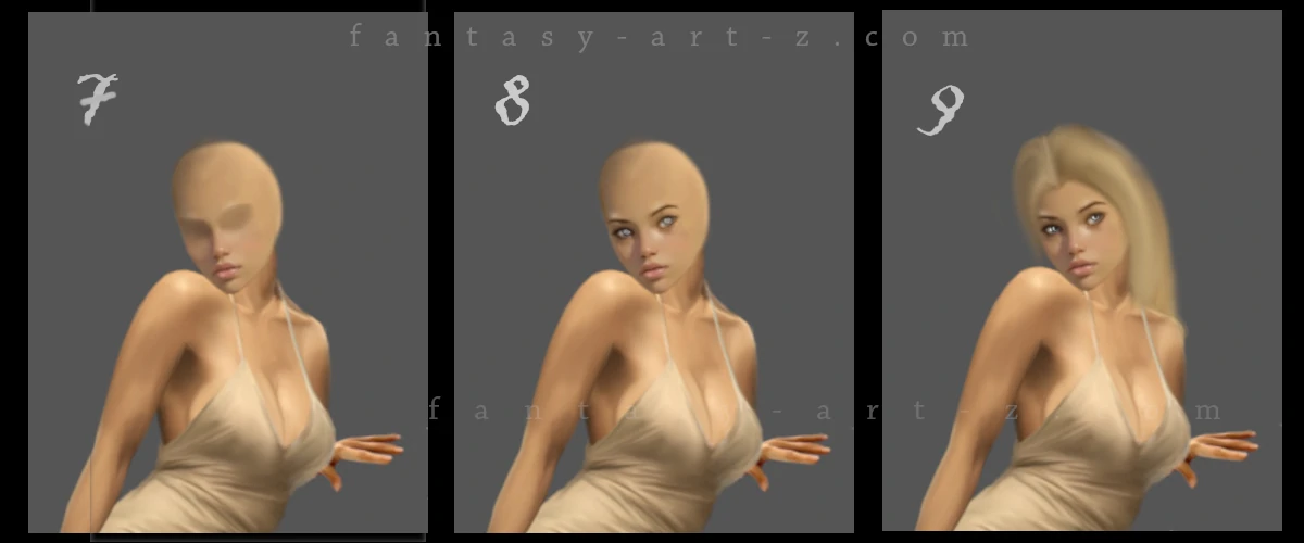
This is where things get real. The face stops being a vague blur and becomes an actual person looking back at you (or somewhere else). Eyes are absolutely critical here, they're the focal point that brings life to the whole painting. (Image 3, Step 8)
Here's the thing about eyes: they're not just white circles with colored dots in the middle. Real eyes have layers of detail. The "whites" of the eyes? Rarely actually white. They have subtle color variations, tiny veins, shadows from the eyelids. The iris isn't a flat color either, it's got patterns, depth, and catches light in specific ways. And that little highlight in the pupil? That tiny speck of light can make the difference between "dead stare" and "living, breathing character."
Working on facial structure at this stage means understanding the planes of the face - where bone is close to the surface (like cheekbones and the bridge of the nose), where there's soft tissue (like the cheeks), and how light plays across all these different surfaces. Small adjustments to the shadows under the nose or the highlight on the brow bone can completely change how the face looks.
💡 Helpful trick : this can help you with basic facial proportions: the space between the eyes is roughly one eye-width, the bottom of the nose to the chin is about the same distance as the nose to the brow. But these are only guidelines, not laws. Every face is different, and what makes your character unique is how they deviate from these "standard" proportions.
At this stage, constantly zoom in and out to check your work. What looks perfect when you're zoomed in 400% painting individual eyelashes might look completely wonky when you view the whole face. Trust your gut. If something feels off, it probably is, even if you can't immediately identify the problem.
Painting the Hair
The hair gets serious attention in next step. (Image 3, Step 9) Hair is one of those things that looks simple until you actually try to paint it. It's not a helmet (though sometimes it might look like one in the early stages). It's got flow, movement, individual strands catching light, shadows where it bunches up.
Here's the biggest mistake beginners make: they grab a tiny brush and start painting individual hairs right from the start. Don't do this. Seriously, don't. It's exhausting, time-consuming, and the results usually look flat and unconvincing. Instead use thes steps:
Step 1 Start with a fairly large, soft brush and block in the main hair shape with a mid-tone color. NOT the darkest shade, not the lightest but somewhere in the middle. Why? Because you need room to go darker AND lighter. And please never use pure black for dark hair. Use a very dark blue-black, purple-black, or brown-black instead. Pure black gives you zero room for variation and looks dead.
Step 2 Now take a darker tone and start blocking in where the shadows live. Think about where the hair bunches up, where it falls behind other strands, where it's furthest from the light source. These shadows define the three-dimensional shape and make the hair look like it has depth. Use soft brush at 70-80%.
Step 3 Time to bring in the light! Using a lighter tone (but not pure white yet), paint where the light hits the hair. For flowing blonde hair like we have here, these highlights are crucial - they're what makes the hair glow and feel alive.
Step 4 Next add individual strands. I personally use "Soft Dip Pen" brush. Paint thin lines that follow the hair's flow. Vary the pressure so strands taper at the ends (thanks, pressure-sensitive tablet!). Add both light strands over dark areas and dark strands over light areas for variety.
Some artists like using a hair-specific brush for this. There are many hair brushes out there, find what suits your needs the most. And you don't need to use only one technique, combine everything in good proportions and remember about photo-bashing too.
💡 Helpful trick : Don't forget that every step of creating the hair you are making on different separete layers. If something is going wrong, you can delete only one layer and not wipe out all hair and start from the beginning. And please, NAME your layers! You think you will remember, but when there are 100 of them, it's a pain in the a** to go through all of them one by one to find something to edit.
Final details: accessories, shadows, and textures
Shadows
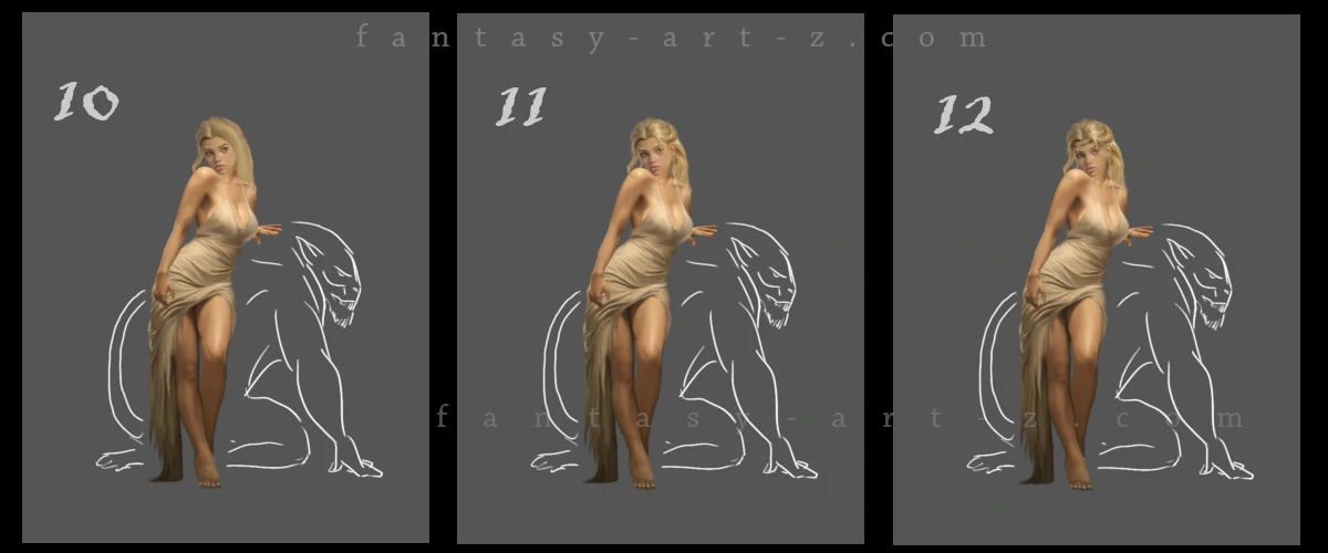
(Image 2, Step 13) Shadows are what givs your art realism and depth. Always use separate layers for each shadow. Here we add shadows under the art, under the chin, under the hair, under the dress. Use soft brush with low opacity 30-50% and after applying the shadow go to Filters > Blur > Gaussian Blur and blur the layer to 3-10% depending on how hard is a shadow: sharp edges for direct light sources close to the subject, softer edges for diffused or distant lighting.
Now here's something crucial about shadows: they're rarely pure black. Shadows typically consist of darker values of the underlying colors, often with cooler tones (blues or purples) due to ambient light from the sky. Instead, sample your base color, shift it darker on the value scale, and add a slight cool tone adjustment. Set layer mode to "Multiply". This creates shadows that integrate naturally with your overall color palette.
Accessories
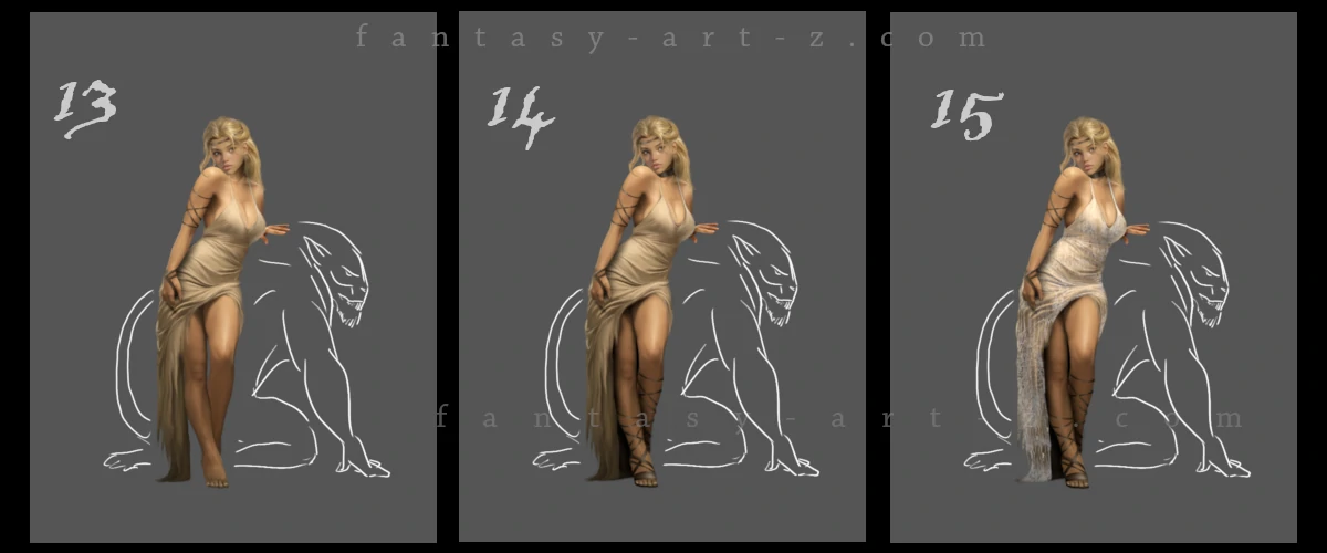
This is where all those little things that make a huge difference happen. (Image 5, Step 13-14) Bracelets get added to those arms, because bare arms are boring and we're not about that life. Each bracelet needs to look like actual metal or whatever material we're going for - with highlights, shadows, and that three-dimensional quality.
💡 Helpful trick : Paint in flat simple color whatever you are going to paint, add shadows and apply textures. I love textures and use them very often. Its what gives my art realistic look.
Shoes! Yes, feet need shoes. Or sandals. Or whatever fits the fantasy vibe. The point is, those feet down there need some love too, even if they're partially hidden. They may be barely visible in the end result but they WILL be visible so get them right.
Dress Texture
This is where that fabric really comes alive. (Image 5, Step 15) Wrinkles, folds, the way light plays across silk or whatever luxurious material this is supposed to be. The dress goes from "flat color blob" to "I can almost feel the fabric" with the right texture work.
💡 Helpful trick : How to use textures? It's easy, but I will get into this discussion in more details in the Second Part of this tutorial, so stay tuned!
Conclusion
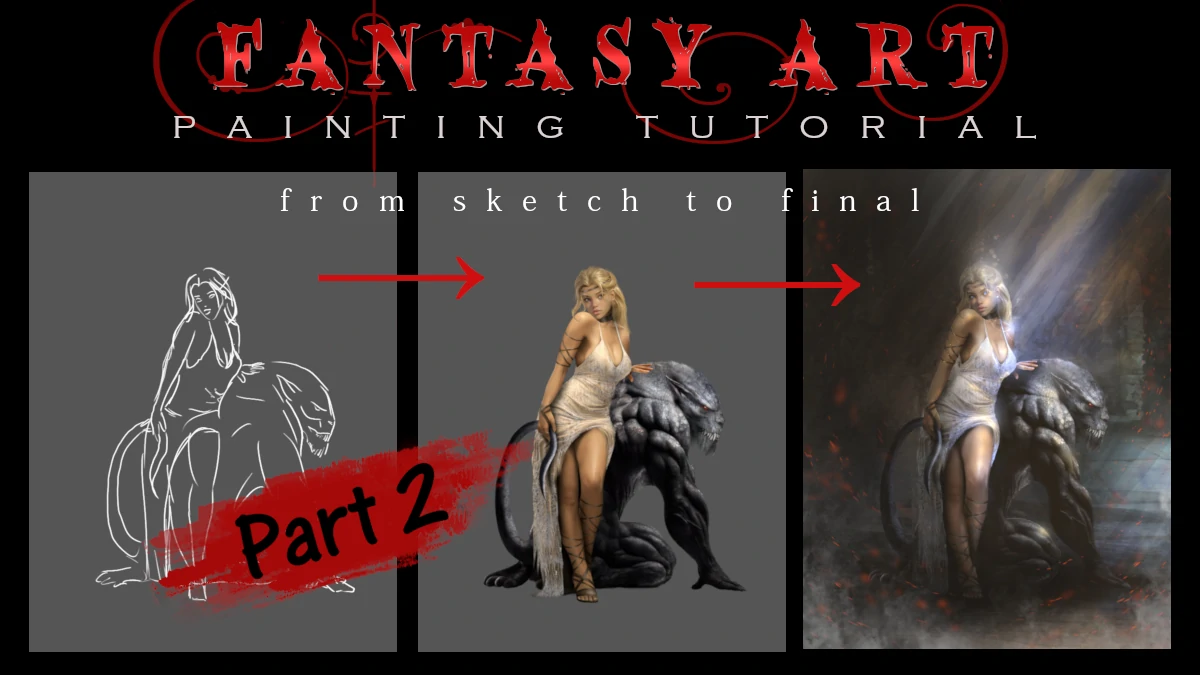
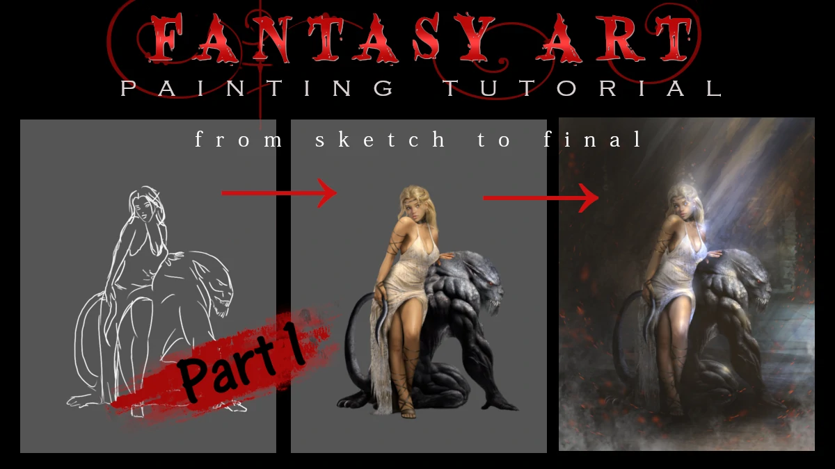
Look at where we started: clean line art, pure potential, completely uncolored and where we ended up. A fully rendered character with depth.
The whole process is about building up layers, making decisions (and sometimes ( many times) changing them), and adding detail upon detail until everything clicks together. It's part technical skill, part artistic vision, and part stubbornly staring at the screen until it looks right.
But we're not done yet. This character is looking pretty solid on her own, but she's still floating in a void like some kind of ghost. In Part 2 of this tutorial, we're going to bring in her pet creature (because every beauty needs a beast, right?), build out a full background environment, and tackle the really fun stuff: dramatic lighting, atmospheric effects, and all those final touches that transform a nicely rendered character into a complete illustration. We'll also dive deeper into those texture techniques I mentioned earlier, plus cover how to unify everything so it actually looks like your character and background exist in the same world. So bookmark this website page, and I'll see you in Part Two where things get really interesting.