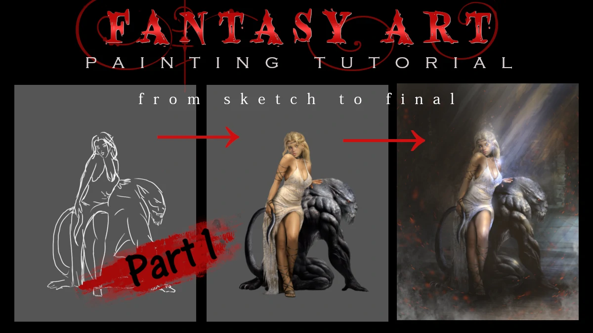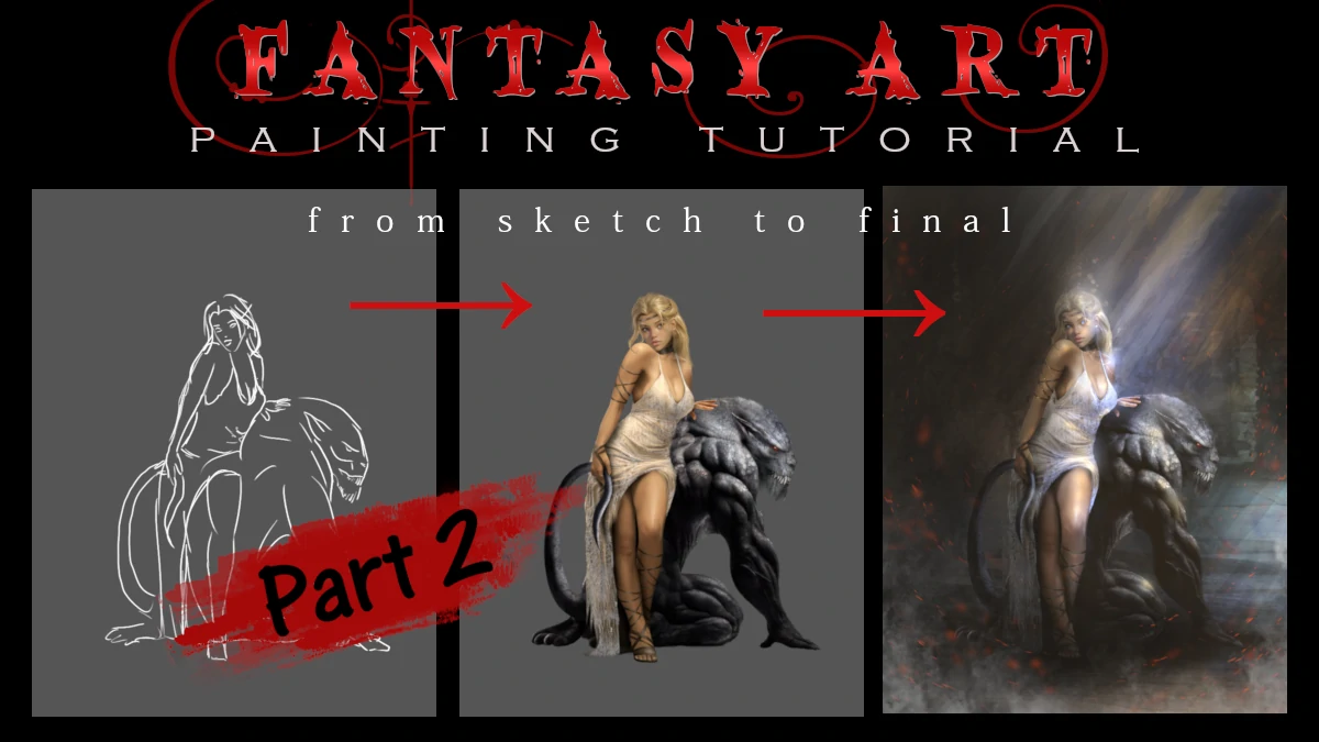
Welcome back to our character illustration tutorial! In Part 1 of this tutorial, we focused entirely on the fundamentals: perfecting the character’s anatomy, ensuring her dress flowed naturally, and giving her an expressive face. Now comes the equally vital stage: bringing her pet creature to life and building the world around them.
As I promised in our previous lesson, we are going to dive deep into textures today. If you thought painting human skin was a challenge, wait until we apply those advanced texture techniques to a creature that only exists in your imagination.
Let there be a Beast!
While the character was already sketched out in In Part 1 , the creature needs its own development process. This is where imagination meets anatomy. Before we can build an environment, we have to define this beast-companion. This phase is all about turning a flat sketch into a living, muscular entity.
Designing the Creature
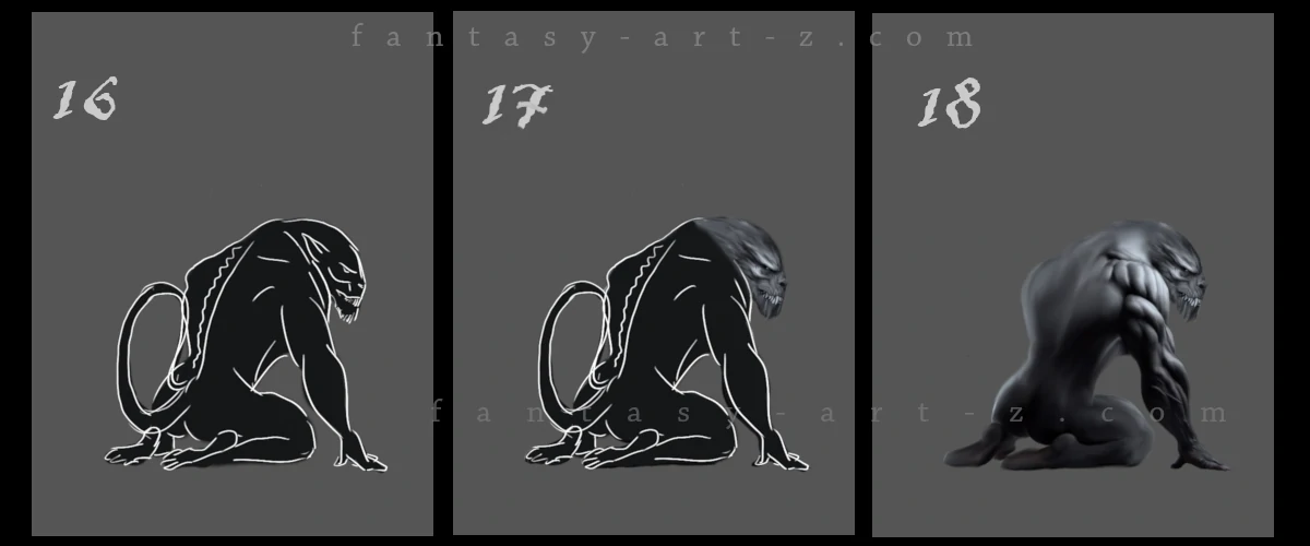
We already had a sketch in the beginning so we don't need to do it again. We start with a blocking simple dark color on the beast to make it in contrast with the background. This allows us to judge the silhouette immediately. Is the pose intimidating? Does the weight feel balanced? Even fantasy beasts need to follow anatomical rules. Think about how real animals are built. This creature has a hunched, powerful posture suggesting strength. (Image 1, Step 16-17)
When its done, use a soft brush with medium opacity to build up the values (light and darkness) gradually. Don't worry about details yet - focme on the big masses.. This is where we define the muscle groups of the back and arms, making the creature feel solid and powerful.( Image 1, Step 18 )
💡 Helpful trick : Key considerations for the muscles:
- Where does the weight rest? This creature is crouched, so the front limbs bear most of the weight.
- How does the spine curve? Even monsters have spines.
- What's the gesture? This one feels protective and on guard.
I made this beast over-muscled. It doesn't need to be like this, but it's just a fantasy, isn't it?
The Texture Promise
Now, let’s get into the details I promised In Part 1 . For a creature like this, "smooth" skin feels unfinished. That's where the textures are coming in.
There are two ways to texture an object: using brushes and using photos.
Texturing with brushes
To use Brushes for Texturing you need to find first a suitable brush. There are thousands of different brushes out there even photorealistic ones.
💡 Helpful trick : I recommend building a massive library of specialized brushes. Don’t just stick to the standard round ones, look for "Reptile Scales," "Leathery Skin," or even "Cracked Stone." For this creature alone, I have a collection of about 50 different scale brushes to choose from! If you're struggling to find specific animal brushes, you can use ones labeled as "Rust," "Grunge," or "Dirt". They are excellent substitutes that can mimic organic grit and skin imperfections.
Once you’ve found that perfect "magic brush," set the opacity to around 70% with 100% hardness. Instead of long strokes, "stamp" the texture across the creature’s form to build up a natural, non-repetitive skin pattern. Don't forget to do it on a separate layer, on "Multiply" mode, so later you can merge them without problems.
I typically set this texture layer to "Multiply" mode and use a neutral black or dark grey color. This allows the texture to sit naturally over your underlying shadows and colors. If you are using a brush that already has color information, "Overlay" mode might work better, but for standard black-and-white texture brushes, "Multiply" is your best friend for a seamless blend.
Textering with Photos
Some people confuse texturing technique with photos with photo-bashing. But they are not the same. You use photo-bashing for the shape, for the base, while textures are laying on that shape. But yeah, both use photos.
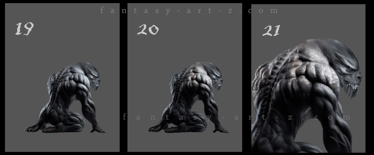
In my tutorial I don't use brushes for textures. I prefer the photos for a more realistic result. Compare flat image (Image 2, Step 19) with the one where I started to apply textures (Image 2, Step 20-21)
So how do we do this? If you don't have yet collection of photos for textures, browse through some stock-photos websites. Many of them are free, or you can buy some photos if you really like them.
💡 Helpful trick : Be carefull what you choose on stock-photos because unfortunately these times 80% of photos out there are AI generated. This happened to me: I found and downloaded the image with texture I like, used it in my painting as a texture and posted it on my social media. In some time someone commented under it, saying that its AI generated image, as a prove providing screenshot showing my image in AI Detector. At first I couldn' understand why but then it's clicked and I run the photo-texture in AI Detector. Yes, it was AI generated and because of it, my whole painting was doomed as AI made. Now I know better and EVERY image I use for textures I inspect first in detector. Be vigilant.
In this tutorial I used a few photos of close-up rhino skin. How to apply it step by step:
- Duplicate "creature" layer. If you make mistakes, you can delete the wrong one and still will have your original layer.
- Put the photo-texture right above the layer with a creature. Set layer to "Multiply" or "Overlay" mode. You need to play with different modes to understand which one suits your needs better.
- Now the photo layer became half transparent and you can see both: creature with flat colors and rhino skin. Two became one and you see your creature with a rhino skin texture.
- Scale down the photo if needed.
- With moving tool place the photo over suitable place. Follow the anatomy logic and pay attention to direction of the skin flow.
- With soft brush erase the edges and corners of the image so you can seamlessly attach next textured layer.
- Zoom in and add those fine details that make viewers go "whoa." Especially on the face. Individual scales catching light, small scratches or scars, subtle color variations in the skin. This is tedious work but it's what separates amateur creature design from professional.
- Proceed putting photo on next layer and move it to next piece of object/creature.
- Watch how your image come to life!
💡 Helpful trick : While you can layer as many textures as you wish, the key is to maintain a sense of balance so you don’t "over-detail" the piece. Here I used 2 textures: "Rhino skin" and above it I have put a "Rusty surface" with low opacity to add grit.
If you’ve already established your base colors, remember to desaturate your texture photos first so they don't clash with your palette. Don't be afraid to experiment with levels to make the texture darker or lighter, and play with different blending modes and opacities. This is the true joy of creation: exploring the unknown until you finally see it on the screen and realize, "Yes, that is exactly how it should be."
Locking the Characters Together
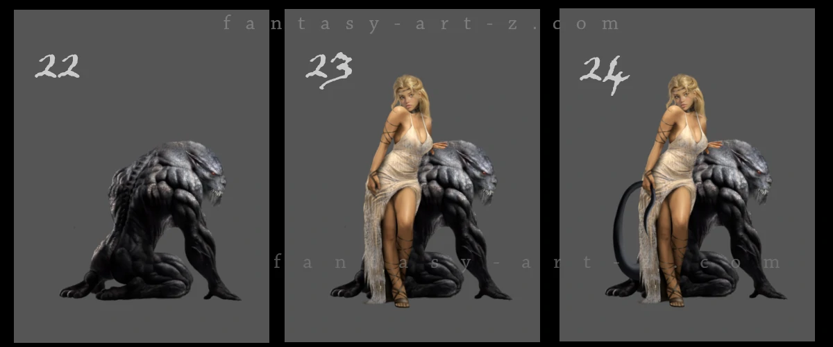
Here is where we bring both characters together (Image 3, Step 23-24). To make the scene feel real, they must interact. We bring our hero back into the frame, positioning her so she physically overlaps the creature's form (Layer with the princess must be above the creature). Notice the addition of the tail that character is holding. This "locks" them together into a single cohesive unit, telling a story of companionship rather than just two figures standing near each other. This is basicaly what "Concept art" means: art showing a story behind it.
Add shadows between the two characters, reflected light bouncing between them. Her dress might pick up some of the creature's darker tones in the shadows. The creature's scales near her hand might catch some warmth from her skin tone. This is called "Color Bleeding" and it makes them feel like they exist in the same space.
World Building
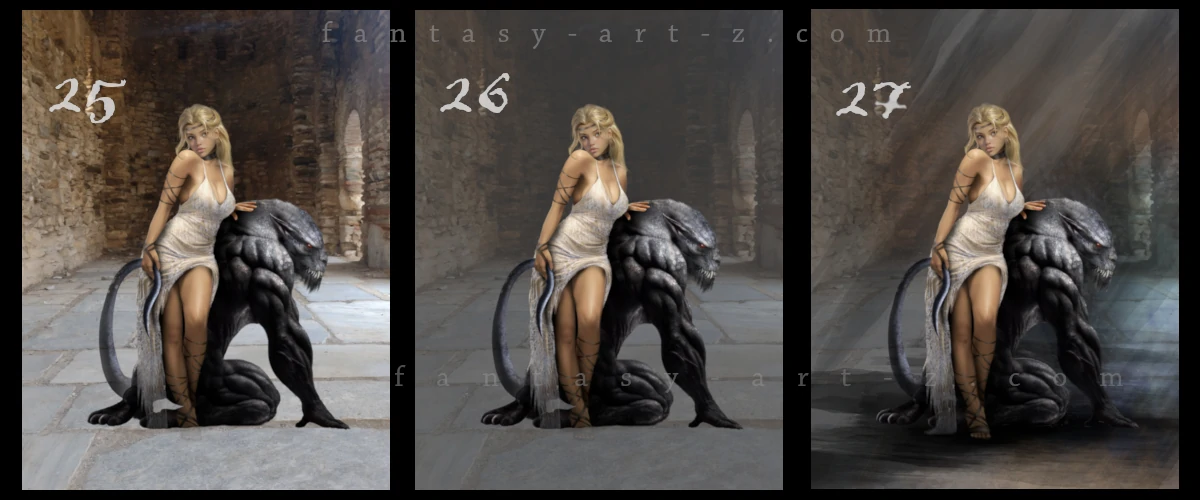
Now that our duo is ready, we need to take them out of the gray void and place them in a believable world. (Image 4, Step 25). There are landscape and architecture artists out there but I don't belong to that group. I am a character/creature artist. That doesn't mean you need to belong to one of those categories, you may equally like to paint all things. I don't. It's boring for me to create landscapes and architectures and this is a reason I use photos for backgrounds. This technique is called "Photo-Bashing" and we were talking about it in Part 1 of this tutorial. If you forgot, go back and reread it.
The background image I used for this tutorial I took by myself. Reminder: If you find your images in internet, don't forget to run them through AI Detector.
As you can notice in Image 4, Step 25, the initial background is quite bright, causing the characters to blend into the environment and lose their impact. To ensure your subjects "pop," you need to create a stronger value contrast between the foreground and the background.
An effective way to achieve this is by lowering the opacity of your background photo layer, allowing the neutral grey base layer underneath to show through (Image 4, Step 26). This immediately desaturates and darkens the background, pushing it into the distance and allowing the highlights on your character and creature to take center stage. This technique is essential for maintaining a clear focal point in complex scenes.
Light and Shadows
Before we start lighting the scene we add rays streaming from an unseen opening above. These rays act as leading lines, directing the viewer’s eye straight to the character's face. (Image 4, Step 27)
💡 Helpful trick : There are "Light ray" brushes out there that you can use, or simply draw light lines with soft brush and blur them. Rays can be visible or almost invisible. You can play with "Screen", "Dodge", or "Addition" modes to achieve the result you need.
One of the most common mistakes in digital illustration is forgetting to ground your subjects, which can leave them looking like they are "floating" in front of the background. To fix this, you must add Contact Shadows directly beneath the characters where they touch the floor or any surface (Image 4, Step 27).
Start by creating a new layer set to Multiply and use a dark, desaturated color sampled from your environment. Paint a very thin, dark line exactly where the character’s feet or the creature's body meets the ground; this is where the least amount of light can reach. As you move away from that point of contact, use a soft brush with lower opacity to create a more diffused "ambient occlusion" shadow. This subtle gradient creates a sense of weight and ensures your characters are firmly anchored within the world you've built.
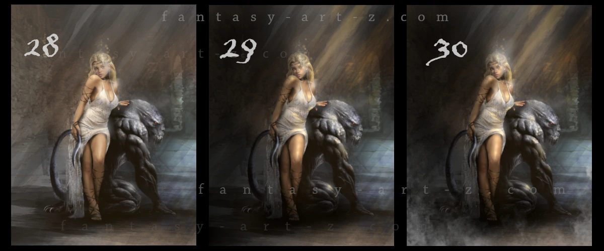
Magic Glowing
The technique we are going to use in (Image 5, Step 28) is most commonly referred to as Bloom or the Glow Effect. In digital painting, this is a staple for creating a dreamy, magical, or high-fantasy atmosphere by making the brightest points of an image appear to bleed light into the surrounding area. To achieve this professionally, you can use the following steps:
- The "Glow" Layer: Create a new layer on top of your finished painting and set the blending mode to Screen, Color Dodge, or Linear Dodge (Add).
- Soft Brushing: Use a very soft airbrush with a low opacity to gently paint over the existing highlights—such as the character's jewelry, the creature's eyes, or where the "God Rays" hit a surface.
- Color Choice: Instead of using pure white, choose a saturated version of the light color (like a warm amber or soft light blue) to make the sparkle feel more natural and vibrant.
- Gaussian Blur: For an extra "dreamy" look, you can duplicate your highlight layer and apply a Gaussian Blur (around 5–15%) to create a soft, ethereal halo around the light points.
Shadows in Enviroment
Do you remember in Part 1 of this tutorialI promised to show you how to apply light and shadow at the end of the process? If you weren't certain about your light source in the beginning, this is your moment.(Image 5, Step 29)
Create 2 layers: one put in Multiply mode and another one in Dodge mode. Take a soft round brush, put hardness an force of the brush to something around 30% and make it a big size enough to cover the corners, like 1000px for example. Play with different sizes and % to find your sweet spot. Use color of the light, but make it dark. In Dodge mode this dark color will become light and bright and in Multiply mode it will become a shadow. Start covering the light area on Dodge layer and shadow part of the image on Multiply layer.
After that create another one Dodge layer, make the same color you used before a little bit brighter and paint some small spots of light that can be fallen on the face of the character, creature, dress, etc.
💡 Helpful trick : For the environmental shadows and lights instead of round brush you can use other brushes to give a texture and form to shadows and lights. For example form of a smoke, or in my case in this tutorial, I used "Sun rays" brushes.
Finally, nothing makes an image feel more "dreamy" or magical than mist and smoke(Image 5, Step 30). Don't be afraid to use specialized "cloud" or "fog" brushes to save time and add that final layer of depth to your work.
Finalising the Image
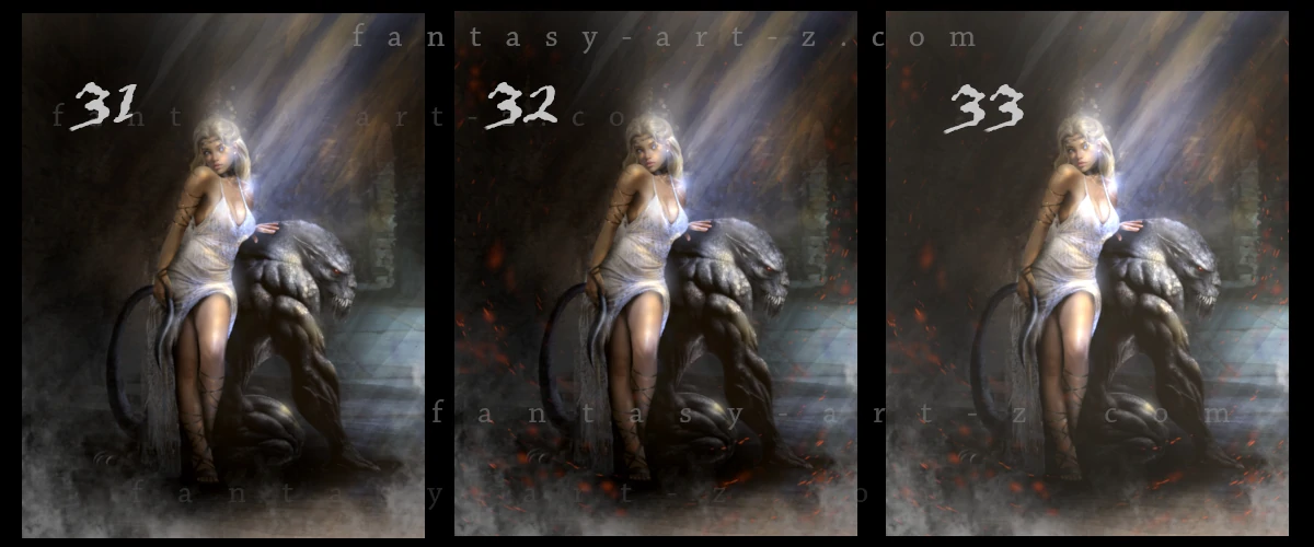
Cinematic Color Contrast
One of the most powerful tools in a fantasy artist's kit is the use of color temperature contrast. To achieve a cinematic look, you want to avoid using only one color family. Instead, try pairing "warm" highlights with "cool" shadows. For example, if your light source is a golden sun ray or a fiery spark, ensure your ambient shadows have a touch of deep blue, purple, or desaturated teal. (Image 5, Step 31)
This contrast works because it mimics how light behaves in the real world while simultaneously creating a "visual vibration" that catches the viewer's eye. By balancing these opposites, you prevent your image from looking flat or muddy. It defines the form of your characters and helps the foreground stand out against the background, giving the entire piece a three-dimensional, high-budget movie feel.
Particles and Sparks
At this stage, the painting might look "clean," but it can sometimes feel a bit static. To breathe life into the environment, start adding micro-details like floating dust motes, glowing sparks, or magical embers. These elements act as "connective tissue" between your character and the background, making the air itself feel like it has volume and texture. (Image 5, Step 32)
💡 Helpful trick :To create particles effectively, you don't need a complex brush pack. A simple Speckle or Scatter brush works best. If you are making your own, take a standard hard round brush and head into the brush settings: increase the Scattering to spread the dots apart and turn on Size Jitter under Shape Dynamics. This ensures that every "spark" has a unique size and position, preventing the effect from looking like a repetitive pattern. Use a bright, saturated color and set the layer to Dodge or Linear Add to make them truly glow.
The secret to realism lies in how you handle focus. Don't leave all your particles sharp. Instead, create two or three separate layers for them. Apply a Gaussian Blur to the particles that are supposed to be very close to the "camera" or far in the background. For sparks that are moving quickly, try using a Motion Blur or Radial Blur to suggest speed. This variety in focus creates a depth-of-field effect, telling the viewer's brain that there is a vast, three-dimensional space within your 2D canvas.
The Ethereal Glow
To wrap up the painting and give it that signature "dreamy" or "ethereal" quality, we use a specialized post-processing technique. Create a new layer on top of your entire stack and fill it with a medium-to-dark neutral grey. Change the blending mode to Addition. At 100% opacity, this will look far too bright, but the magic happens when you start sliding the opacity down. (Image 5, Step 33)
Slowly lower the layer opacity—usually staying between 5% and 12%. This technique gently "lifts" the black levels in your shadows and adds a soft, atmospheric haze over the whole image. Unlike simply changing the brightness or contrast, the Addition/Grey method creates a soft glow that makes the colors feel unified and "creamy." It’s the perfect way to finish a fantasy piece, leaving it looking polished, magical, and professional.
Conclusion
Digital painting is a journey of a thousand small decisions, from the first sketch to the final glowing spark. I hope this tutorial has been a helpful companion for those who have decided to create a book cover by themselves or for anyone looking to master the art of fantasy illustration. Remember, every master was once a beginner. The "magic" in a painting comes from patience and practice.
However, if you feel that the technical side of painting is a bit too daunting or you simply want a professional touch for your next big project, you can always commission an artist to bring your ideas to life. If you choose this path, be sure to read my Guide on How to Commission an Artist to ensure the process goes smoothly and you get the best possible result.
Finally, if you fell in love with the piece we created during this tutorial, I have some good news! The full illustration, "Beauty and the Beast," is currently available both as a high-quality art print and as a ready-to-use book cover. Thank you for following along, and happy painting!