Brutal Honesty Time: If you actually want to sell books, hire a professional. I know, I know, you’re very proud of that drawings you make, but there is a massive difference between "nice hobby art" and a cover that actually sells books. However, this article is for the brave souls (or the incredibly stubborn ones) who have looked at a blank canvas and said, "I can do that. How hard can it be?"
The Why and the How
Why on earth are you doing this yourself?
Maybe you know your way around a layer mask and basic buttons on a Photoshop, or maybe you just have deep-seated trust issues with artists and are afraid to be scammed. Perhaps you’re convinced that to be an illustrator is not a real job. But let’s be real: usually, it’s the budget. While "I’m broke" is a valid reason, remember that premade covers exist and artists in emerging economies offer great deals on Fiverr. But if you’ve set your heart on doing it your way, let’s at least make sure you are armed with the right information.
Tools (Choose Your Weapon)
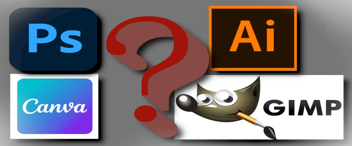
First thing’s first: you need a digital canvas. Which program to choose?
- Adobe Photoshop. If you’re doing your cover specifically to save money, yet you’re still shelling out a monthly subscription for Adobe Photoshop, we need to have a serious talk about your financial strategy. Paying a monthly "tax" to a billion-dollar company just to save a few hundred bucks on a hungry artist is like buying a whole cow because you wanted a single burger.
- GIMP is the program I use and let’s set the record straight: it is an absolute beast. While some people get distracted by flashy, colorful interfaces, GIMP stays focused on what actually matters—professional performance. It’s a lean, mean, designing machine that gives you almost every capability of Photoshop without the corporate bloat.
- Canva: The instant design. It’s perfect for the "drag-and-drop" crowd who just want to get it done. Just be careful: if you use their standard templates without changing much, your book might end up looking like ten other books in your genre.
- Affinity Photo: It’s professional, modern, and the best part is a one-time payment. No subscriptions, no monthly heart attacks when you see your bank statement.
- Adobe Illustrator: You’ll hear professionals talk about "Vector art" and "Scalability" here. Unless you are planning to print your book cover on the side of a literal skyscraper, you probably don't need to dive into this complicated mess for your first project.
The design is straightforward and functional, which is exactly what you want when you're deep in the creative zone. Because it’s Open Source, it’s built by people who actually use it, resulting in a tool that is incredibly powerful and surprisingly simple to navigate once you see how it’s structured. You get high-end features for zero dollars. It’s the ultimate "secret weapon" for artists: all the power of a professional studio, packed into a free program that respects your intelligence and your budget.
If GIMP feels like trying to learn a dead language, you have other options:
The "best" software is the one you actually know how to use. Don't spend three weeks watching tutorials on how to open a file in Photoshop when you could have finished a beautiful layout in Canva in three hours. Your readers care about the art, not the brand of the hammer you used to build it.
Right Calculations: Don't Guess the Size
The Math Behind the Art
Before you even pick up a digital brush, you need to decide your destination. On Amazon, you aren't just uploading a digital file for Kindles; you are often preparing a full physical product. If you ignore the math now, your "beast" of a program won't save you later when Amazon’s uploader starts throwing error messages at you.
E-book vs. The Full Wrap
If you are just doing an E-book cover, you only need to worry about the front. The most common dimensions you’ll see used are 1800 x 2700 pixels. This gives you plenty of resolution to look sharp on high-definition screens without creating a file so heavy it takes a year to upload.
But Amazon isn't just a digital bookstore, it's a massive printing house. If you want to sell actual physical books, you need to create a Full Wrap. This is one single, continuous image that covers the front, the back, and that tricky little bridge in the middle: the spine.
Here is the catch: there is no "standard" size for a wrap. Why? Because the width of your spine depends entirely on how many pages are in your book and what kind of paper you choose. White paper and cream paper have different thicknesses! If you have 200 pages, your spine might be thin; if you have 600, it’s a brick.
Don't try to calculate this manually unless you enjoy headaches. Go straight to the KDP Cover Calculator on Amazon.com. You plug in your page count and trim size, and it spits out a precise template. You can then open this template directly in your prefered program as a layer, so you know exactly where the spine sits and where the "safe zones" are. This ensures your title doesn't accidentally wrap around to the back of the book because your math was off by a few pixels.
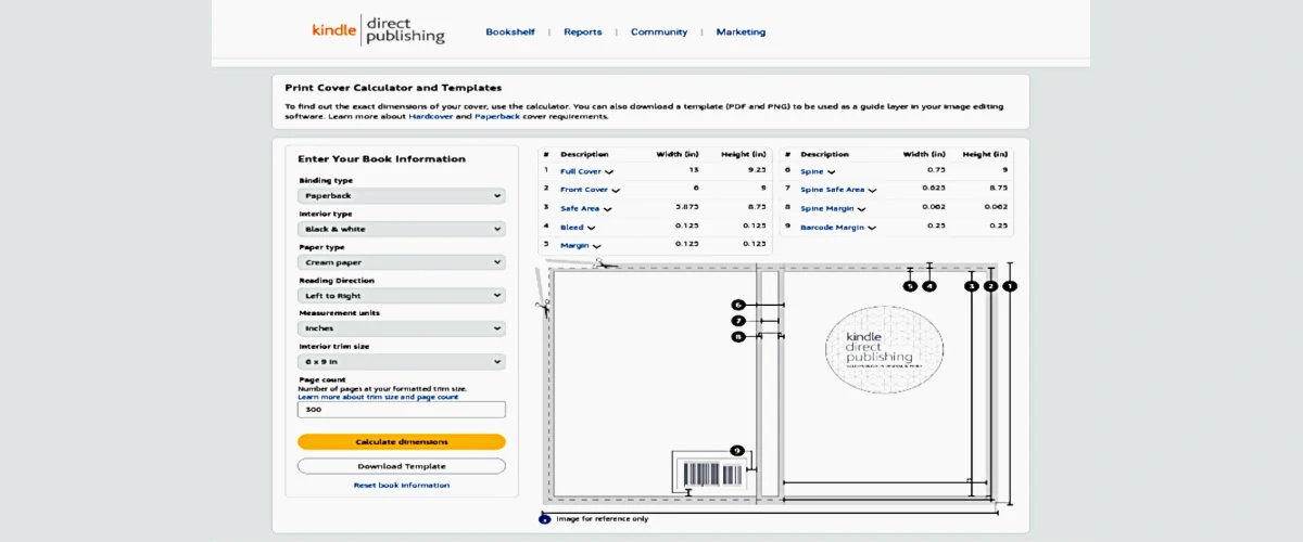
How to use Amazon's cover calculator
Amazon’s calculator might look like a boring government form, but it is actually the most important tool in your arsenal. Here is how to fill it out without losing your mind:
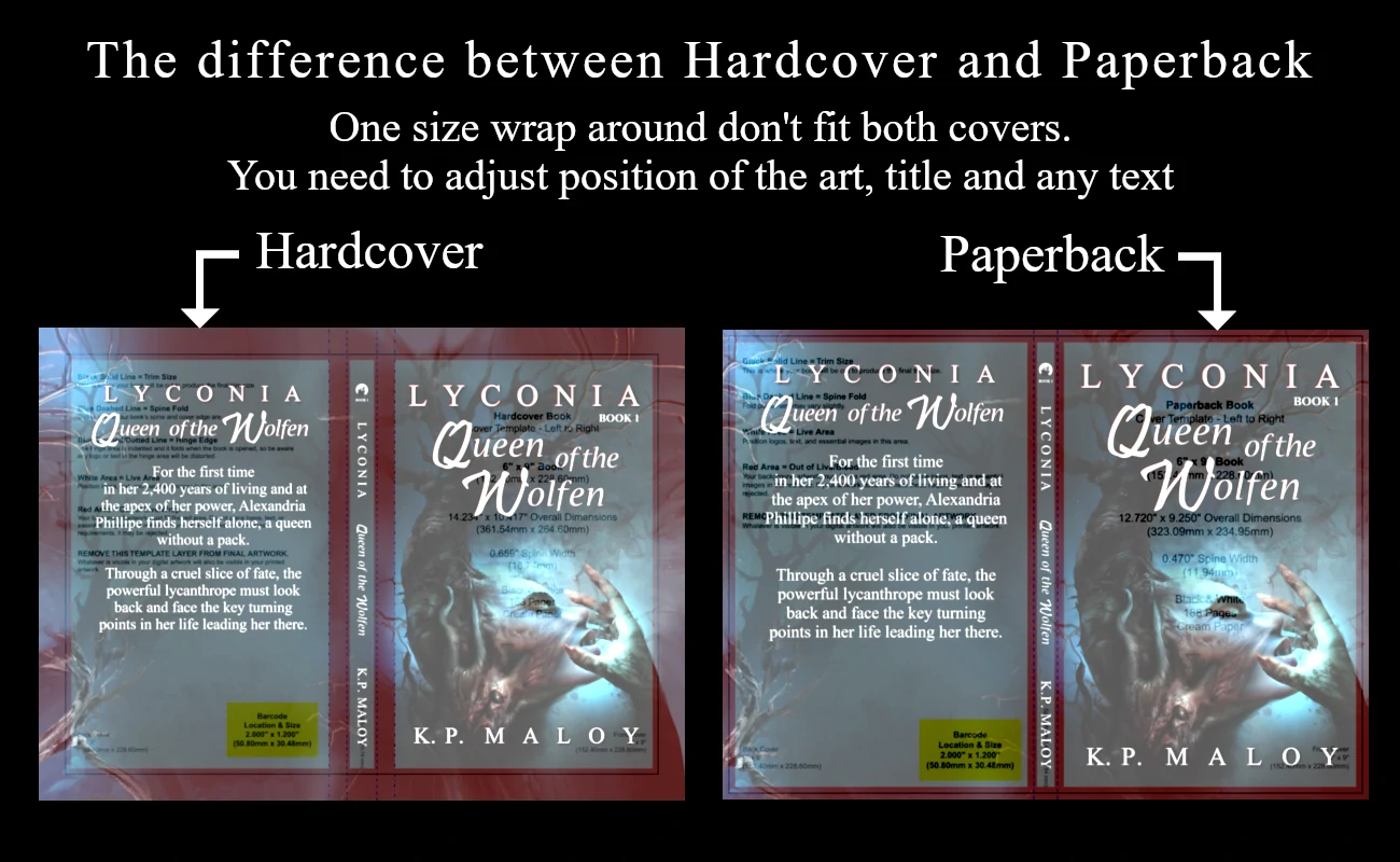
- Binding Type: Paperback or Hardcover? Decide this now. Hardcovers are physically larger because the cardboard "case" extends past the pages, while paperbacks are cut flush. If you need both, you’ll need to run two separate calculations and create two different files. There is no "one size fits all" here!
- Interior Type: The Color Game. Most authors choose Black & White to keep printing costs low (and royalties high). Just remember: if you have photos inside, they’ll be converted to grayscale. If you go for Standard Color, the images are a bit more matte. Premium Color is the "beast" mode of printing, it's what you want for children's books or photography where the colors need to pop off the page.
- Paper Type: White vs. Cream. This isn't just an aesthetic choice; it’s a math choice. Cream paper is slightly thicker than white. It might not seem like much, but across 300 pages, it changes the width of your spine significantly. Generally, Fiction and Poetry look "classic" on cream, while Non-Fiction and Textbooks stick to white.
- Reading Direction. For most of us, this is Left to Right. If you’re writing a book in a language like Hebrew or Arabic, you’ll switch this to Right to Left so the spine and back cover are on the correct sides.
- Measurement Units. Inches or Millimeters? Choose whichever one makes your brain hurt less. Just make sure your settings in GIMP match what you choose here!
- Interior Trim Size. This is the physical size of your book. While 6 x 9 inches is the "king" of fiction sizes, Amazon offers everything from pocket-sized to coffee-table huge. Pick the size that fits your genre.
- Page Count. Be honest! Don't use your "rough draft" page count. You need the final, formatted page count of your interior file. Even five extra pages can shift your spine alignment. If you hire a professional artist they can adjust your cover later at any time, but since you do it by yourself try to do it precise so not to do it again.
Once you’ve filled in the blanks, hit that "Calculate Dimensions" button (the one that turned yellow to congratulate you). Don't just look at the numbers—click "Download Template." You’ll get a ZIP file containing a PDF and a PNG. Now you have a perfect map of where to put your art.
Composition: building the cover
Once you have your dimensions, it’s time to head into your drawing program.
The "Ghost" Template Strategy
Here is the pro secret for getting your placement right: Put your Amazon template on the TOP layer.
Don't leave it at the bottom where your art hides it. Instead, place the template as your topmost layer and drop the Opacity to around 15%. This creates a "ghost" overlay. Now, as you work on the layers underneath, you can clearly see the trim lines, the spine, and the barcode area sitting right on top of your art. It’s like having a translucent map over your canvas.
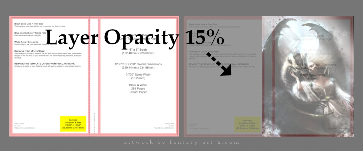
While you are arranging your layers, keep a close eye on those colored zones on Amazon's template:
- The Safe Zone: This is the center of the action. Your main subjects must live here.
- The Trim & Bleed: If the most important part of your character’s face is touching the pink/grey lines on your top-layer template, move the image! Anything in those zones is at risk of being sliced off during the physical printing process.
The Focus Point: Telling a Story
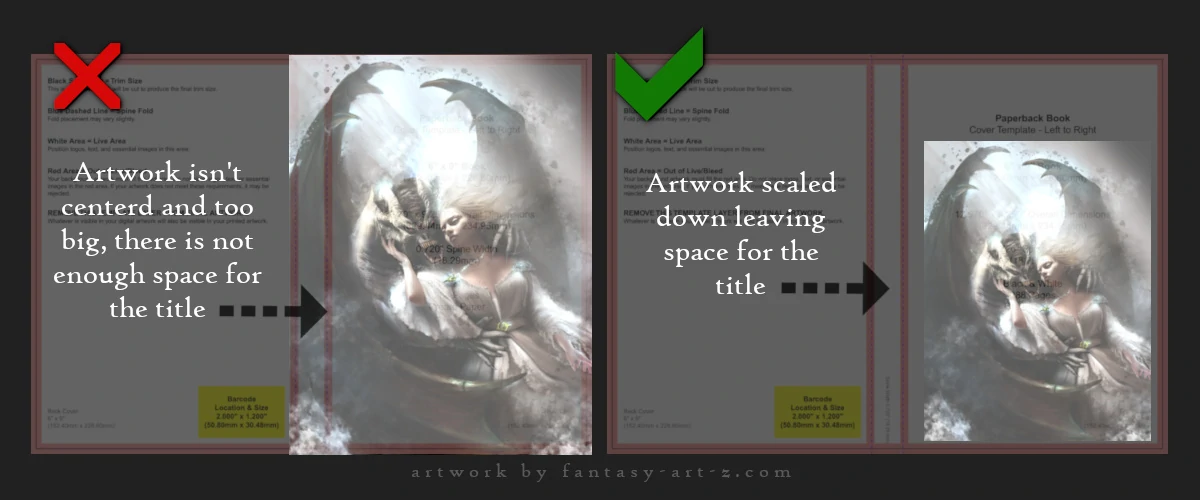
Your artwork is the soul of the book. Whether you are using a purchased illustration or creating something from scratch, you need to think about where the eye lands first. Think about the focus point. Characters and scenes are better look in the middle but you need also to think where you are going to put your title and name and leave enough space for other text if you have any. Above the image? Under the image? How big the title is going to be? Will there be a subtitle or any other text? Leave enough "empty" space (usually at the top or bottom) so that when you eventually add your text, the image and the words aren't fighting for attention.
Cover Background: The Art of the Seamless Blend
Once your main image is perfectly positioned under your "ghost" template, you’ll likely notice a problem: the image doesn't perfectly fit the entire width of the wrap. This is where most sef-made covers look "cheap", when there’s a harsh line where the art ends and a random color begins.
To fix this, create a new blank layer underneath your main artwork. Using the eyedropper tool, pick a few dominant colors directly from your artwork and paint with them the entire bottom layer using suitable brush.
Now comes the "Beast" mode: Blending. Use a soft-edged eraser or a layer mask to gently fade the edges of your main artwork into that background. Blending with the same brush you used for background will make all the difference. The goal is to make it impossible to see where the photo ends and background begins. This creates a professional, unified look that flows across the spine and onto the back cover.
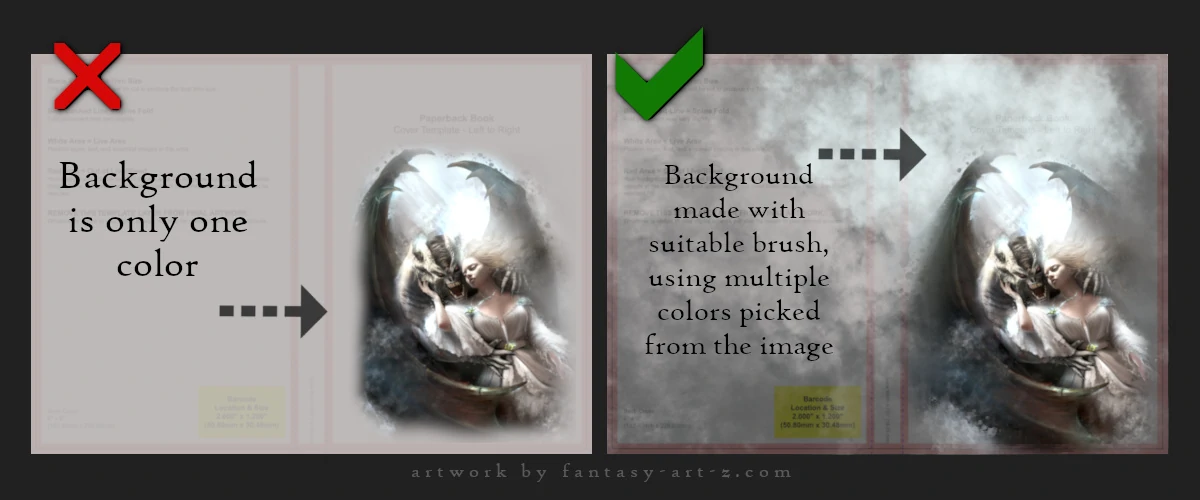
It is absolutely essential that this background color fills the Grey Area (The Bleed) of your template. When the physical book is printed, it is printed on a larger sheet of paper and then trimmed down. If your color doesn't reach the very edge of the file, you might end up with a terrifying thin white line at the edge of your book where the paper shows through. Always "over-paint" your background into those margin areas to stay safe.
Let's there be Title!
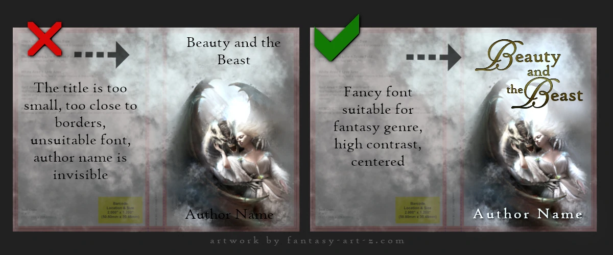
The image is the hook, but the title is the anchor. You have worked hard on your art, but if a reader can’t see the title clearly from across the room—or more importantly, from a tiny thumbnail on a screen—you’ve lost them. Before we even talk about specific fonts, we need to talk about Readability.
The most common mistake in self-made designs is making the title too small because the author doesn't want to "cover up" the artwork. Don't be afraid to go big! Your title needs to be bold enough to tell what the story is about. But maybe in this case you will need to downscale a little bit your art.
Some tips:
- Contrast is King: If your artwork is dark like many horror book covers, your title should usually be light or vibrant. If your art is bright, use a dark or deep color for the text. If the colors are too similar, the title will "sink" into the image and disappear.
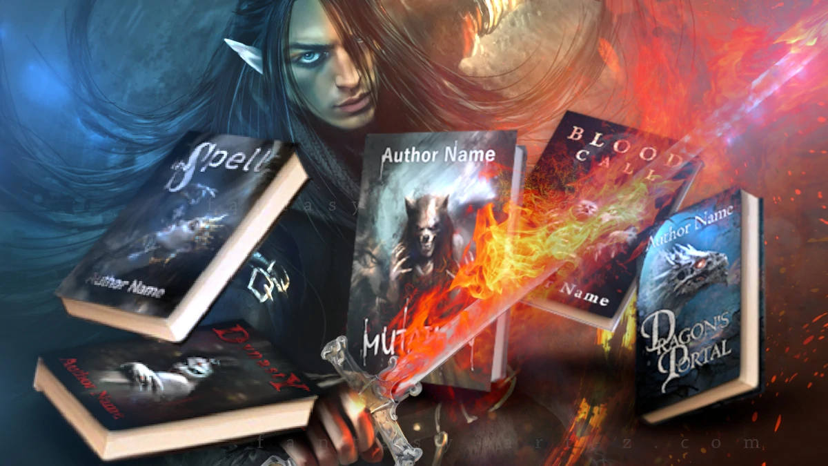
- Give it Space: Don't crowd your title against the edges of the "Safe Zone" we talked about earlier. Give the words some room to breathe. A title that is jammed too close to a character's face or the edge of the page looks accidental. You want it to look intentional. For example take a look at these premade book covers to have a basic idea.
If your background is very busy and "noisy," you might find it impossible to find a clear spot for the title. In that case, you may need to add a new layer under the text layer and create a slightly darker or lighter "glow" behind where the text will sit. Think of it as creating a stage for your title to perform on.
Choosing the Right Font: Personality in Letters
This is a huge topic because fonts carry the "mood" of the book just as much as the artwork does. Even the most beautiful illustration can be ruined by unsuitable fonts. You can have the most gorgeous, professionally painted cover art known to humankind but slap the wrong font on there, and suddenly your epic fantasy novel looks like a grocery store flyer advertising discount potato salad. It happens. I've seen it. It haunts my dreams.
Typography isn't just about picking something that looks "cool" or "matches the vibe." It's about readability, professionalism, and making sure your potential readers can actually read your title from across a crowded bookstore (or from a tiny thumbnail on Amazon). It's the difference between "wow, I need to read that" and "what does that even say?"
The Secret Language of Letters
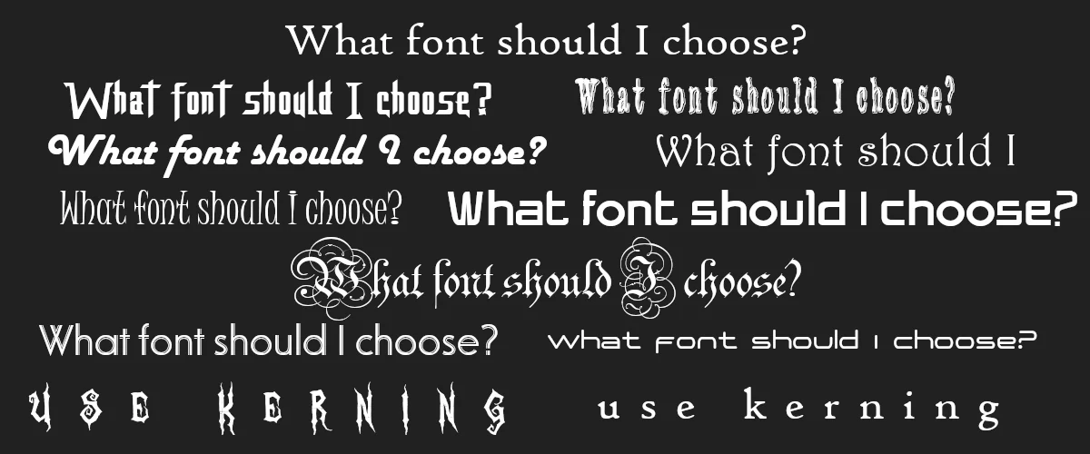
With thousands of fonts available at your fingertips, the temptation to pick the most "unique" or "fancy" one is strong. Resist it. In the world of book design, simple is almost always better. Your font isn't just a label; it’s a messenger that tells the reader what genre they are about to step into before they even read the first word.
- Fantasy/Romantasy: This is the land of the "swirl." We’re talking elaborate script fonts, flowing flourishes, and enough decorative curls to make a Victorian architect dizzy. These ornate, calligraphic styles scream "magic" and "otherworldliness." If there’s a romance element, go crazy with the swirls, make those letters look like they’re flirting. High fantasy might pair these scripts with complementary "Serif" fonts (the ones with the little feet on the letters) for subtitles.
- Sci-Fi: Keep it clean, keep it sleek, and for heaven's sake, keep it modern. You want Sans-Serif fonts that look like they were designed by a robot in a sterile lab. Think geometric shapes, sharp angles, and wide, extended letters that feel like the vastness of space.
- Horror/Thriller: You want your reader to feel slightly unsafe before they even open the book. In Supernatural Horror, go for "distressed" fonts that look like they are decaying, bleeding, or scratched into a basement wall by something with claws. If you’re writing a Psychological Thriller, go the opposite way: use stark, bold, "claustrophobic" fonts that are squeezed tightly together. Irregular letterforms suggest your narrator is unstable, which is exactly the vibe you want. Condensed fonts can feel claustrophobic, while irregular letterforms suggest instability.
Where to find fonts?
The good news? The internet is absolutely drowning in fonts. Seriously, there are more fonts out there than there are opinions about pineapple on pizza. Here are some treasure troves to get you started:
- Google Fonts is like the reliable friend who always shows up on time. Clean, organized, and everything's free. No drama, no surprises.
- DaFont is my personal favorite. Think of it as the quirky vintage shop where you can find anything from elegant script fonts to ones that look like they were written by caffeinated squirrels. It's glorious chaos in the best way possible.
- 1001 Fonts does exactly what it says, except there are way more than 1001 fonts. I'm pretty sure they can't count, but who's complaining?
The Legal Side: Don’t "Accidentally" Steal
This is the most important rule: Fonts are art, and art has licenses. Just because a font is on your computer doesn't mean you have the right to sell a book with it. And yes, printing your book and selling it absolutely counts as commercial use. I know, I know, it seems obvious, but you'd be shocked how many people skip right past this part.
When you're browsing, look for the magical words "100% free" or "free for commercial use." Filter ruthlessly. Your future self (and your lawyer, if you have one) will thank you.
Of course, if you stumble upon a font that makes your heart sing and your wallet isn't entirely empty, you can always buy a license. Think of it as supporting the weird, wonderful people who spend their time making letters look pretty. They deserve snacks too.
I'm not going to hold your hand through downloading and installing fonts on your computer. You're a capable human who's writing an entire book—you can figure out how to double-click a file. I believe in you. Instead let's talk about hierarchy
Let's Talk Hierarchy
Your cover must have an order, and it goes like this:
Your typography choices should reflect this hierarchy. Make your title big, bold, and impossible to ignore. The subtitle can be smaller, maybe in a complementary font. Your name should be visible but not screaming for attention (unless you're Stephen King, in which case, why are you reading this?).
The Art of Not Overdoing It (Seriously, Don't)
Here's where the magic happens: using your fonts the right way. The golden rule? Stick to 2 ( max 3 ) different fonts on your cover. That's it. No more. I don't care how pretty that fourth font is. Put it down. Step away slowly. Breath.
Here's a Pro-Tip that'll blow your mind: play with kerning. That's the fancy typography word for "spacing between letters." Adjust the kerning, and suddenly the same font looks completely different. Spread those letters out for a sleek, modern vibe. Tighten them up for intensity.
Consistency is Key: The Wrap-Around Rule
Alright, so you've nailed your front cover typography. It looks amazing. You're feeling pretty good about yourself. You might even be doing a little victory dance. But hold on there, you're not done yet.
Here's something that separates the "I made this in my basement" covers from the "wait, this is actually self-published?" covers: your typography needs to match across the entire book wrap. That means front cover, spine, AND back cover. They all need to speak the same visual language. The fonts you choose for your title on the front need to carry through to the spine and back. Same family, same style, same vibe.
Your spine is where things get tricky because you're working with limited real estate. But guess what? It still needs to match. Use the same font for your title that you used on the front cover. Yes, you might need to adjust the size or spacing to make it fit, but keep it consistent.
The Back Cover: Where Typography Meets the Blurb
The back of your book is where potential readers go to decide if your story is worth their hard-earned cash (or their precious Kindle Unlimited credit). This is blurb territory, and yes, typography matters here too.
Your blurb font should be clean and readable, remember, people are actually going to read this part, not just glance at it. This is where you can break away from your decorative title font and use something simpler. A clean sans-serif or easy-to-read serif works perfectly here. I've seen too many back covers where someone picked a fancy font that looks gorgeous but is about as readable as ancient hieroglyphics after three glasses of wine. Your blurb has one job: to convince someone to buy your book. It can't do that if they need a magnifying glass and a cryptography degree to read it.
Conclusion
When you step back and look at your full book wrap laid out flat, it should feel cohesive. The front catches their eye, the spine makes it easy to find on a shelf, and the back seals the deal. All three working together in typographic harmony.
This is your book cover you're creating, and consistency is what makes it look professional rather than DIY-disaster. Match your fonts, match your style, and for crying out loud, make sure everything is spelled correctly on all three sides.
Scale for internet-sharing
And the last Pro-Tip for today: when your book covers is done, make a copy or a front cover and downscale it to approximately 800px biggest size. Make it look sharp ( many tools in drawing programs make that possible) and use it for internet sharing. Because when you share the actual size on internet it becomes downscaled automatically and loses all that sharpness and no one is going to click on it if it's blurted or pixelated.